Shinone Apple Farm
Branding & Identity, PackagingShinone Apple Farm
2017 - 2018
Shinone Apple Farm is a small independent apple grower in Okhotsk,
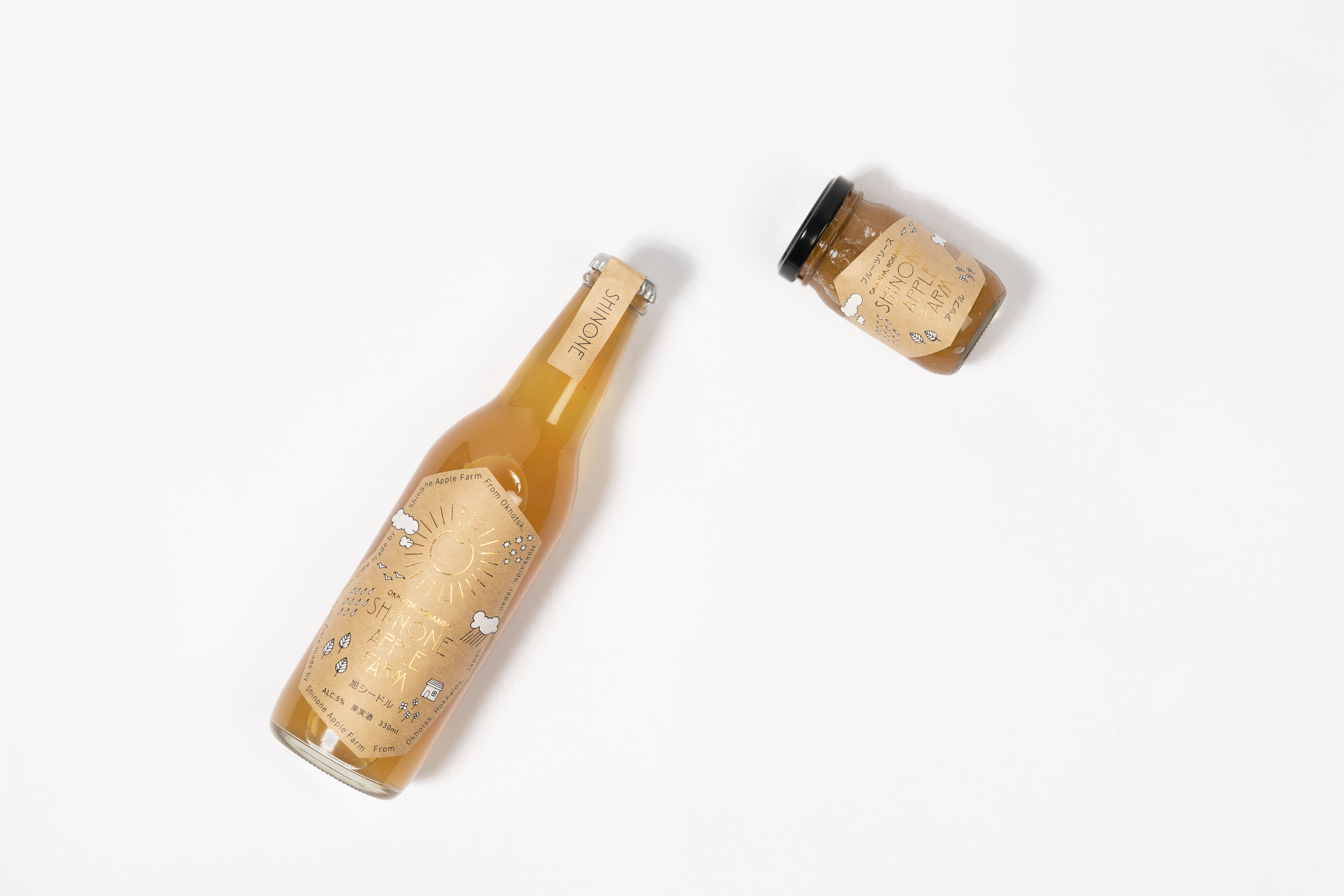
the northernmost part of Hokkaido, Japan. Okhotsk was once abundant with the Asahi apple, but now Shinone Apple Farm is one of the few remaining producers. They specialize in growing the Asahi apple, also known as the McIntosh, using only organic fertilizers and without the use of herbicides. They take pride in hearing their customers say, "I never knew that apples were so delicious!” as they bite into one of their prized apples or sip Japan’s first cider made from 100% Asahi apples.
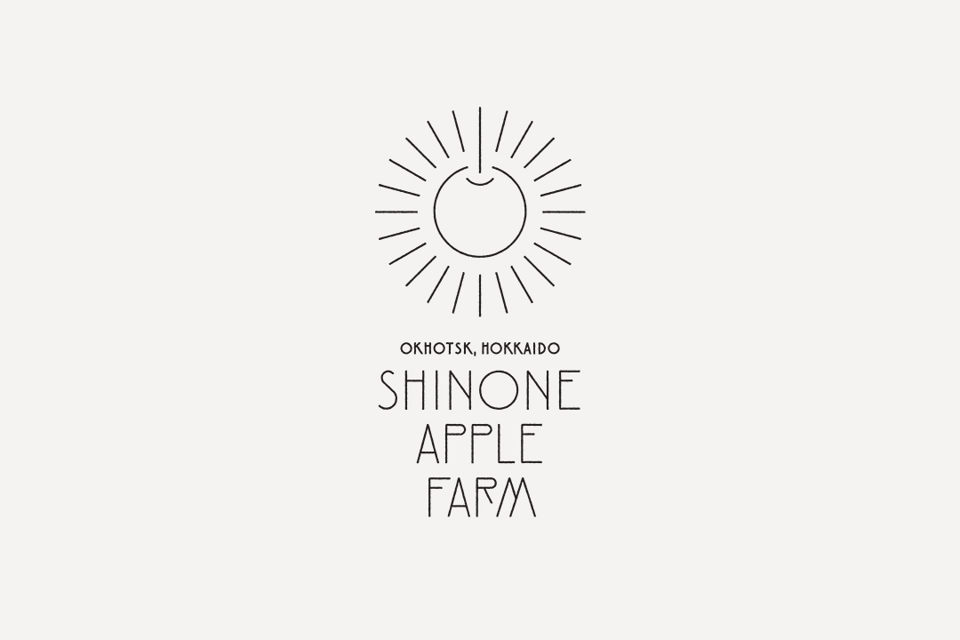
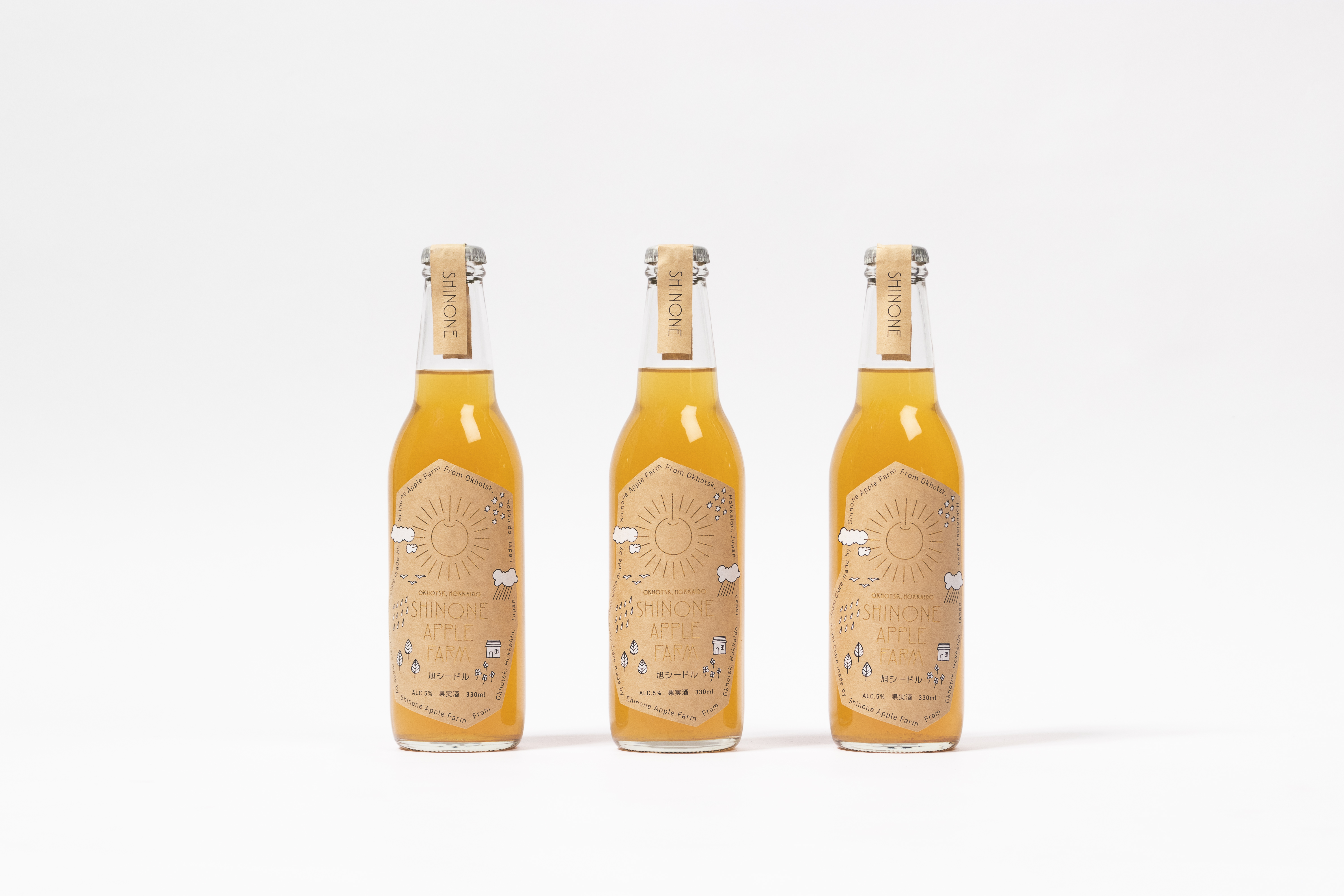
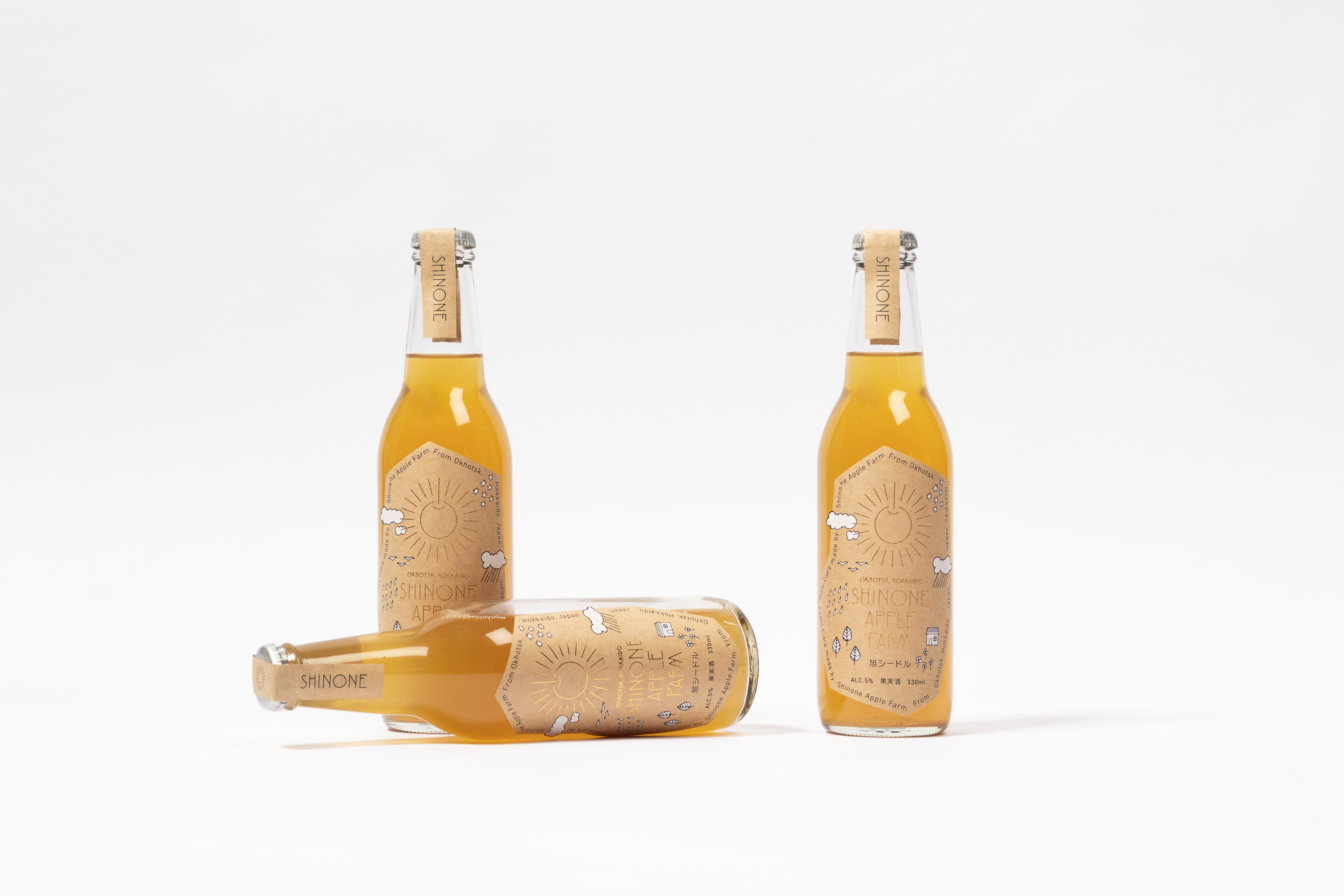
Asahi in Japanese means the rising sun or the morning sun, giving way to the logo: an apple sun, rising over Okhotsk. Just as the rising sun symbolizes hope for a new day, the Asahi apple gives hope to the apple producers in Okhotsk. Carefree illustrations adorn the packaging, depicting the Okhotsk region and its charm. Kraft paper communicates the rustic image of an apple farm in the country. Gold leaf adorns the packaging like shining rays of sun.
Branding: COMMUNE
Art Direction: Ryo Ueda
Creative Direction: Midori Yamanaka
Design: Ryo Ueda, Alessandro Riva, Connie Dispa, others
Illustration: Connie Dispa, others
Year: 2017-2018
Client: Shinone Apple Farm
Sapporo ADC 2018 Packaging Category Selection / Packaging
Sapporo ADC 2018 CI, Symbol, Logo & Typography Category Selection / Logo
Featured in:
Design Note No.79 [Seibundo Shinkosha / Japan] (2018)
MdN Designers File 2019 [MdN Coeporation / Japan] (2019)
SB Creative / China] (2021)
Redesigning Logos [Sandu / China] (2021)
Logo Designs in that Communicate Trust & Honestly [PIE BOOKS / Japan] (2021)
Food & Drink Logos [Counter-Print / UK] (2022)
︎
↑ All Projects
︎ Previous Project
︎ Next Project