Sapporo Convention Bureau
Branding & Identity, Stationery, Print, Promotional ToolsSapporo Convention Bureau
2018 -
We rebranded the Sapporo Convention Bureau, which transmits the charms of Sapporo to the world and attracts MICE (Meetings/Incentive Tours/Conventions/Exhibitions) such as international conferences and exhibitions.
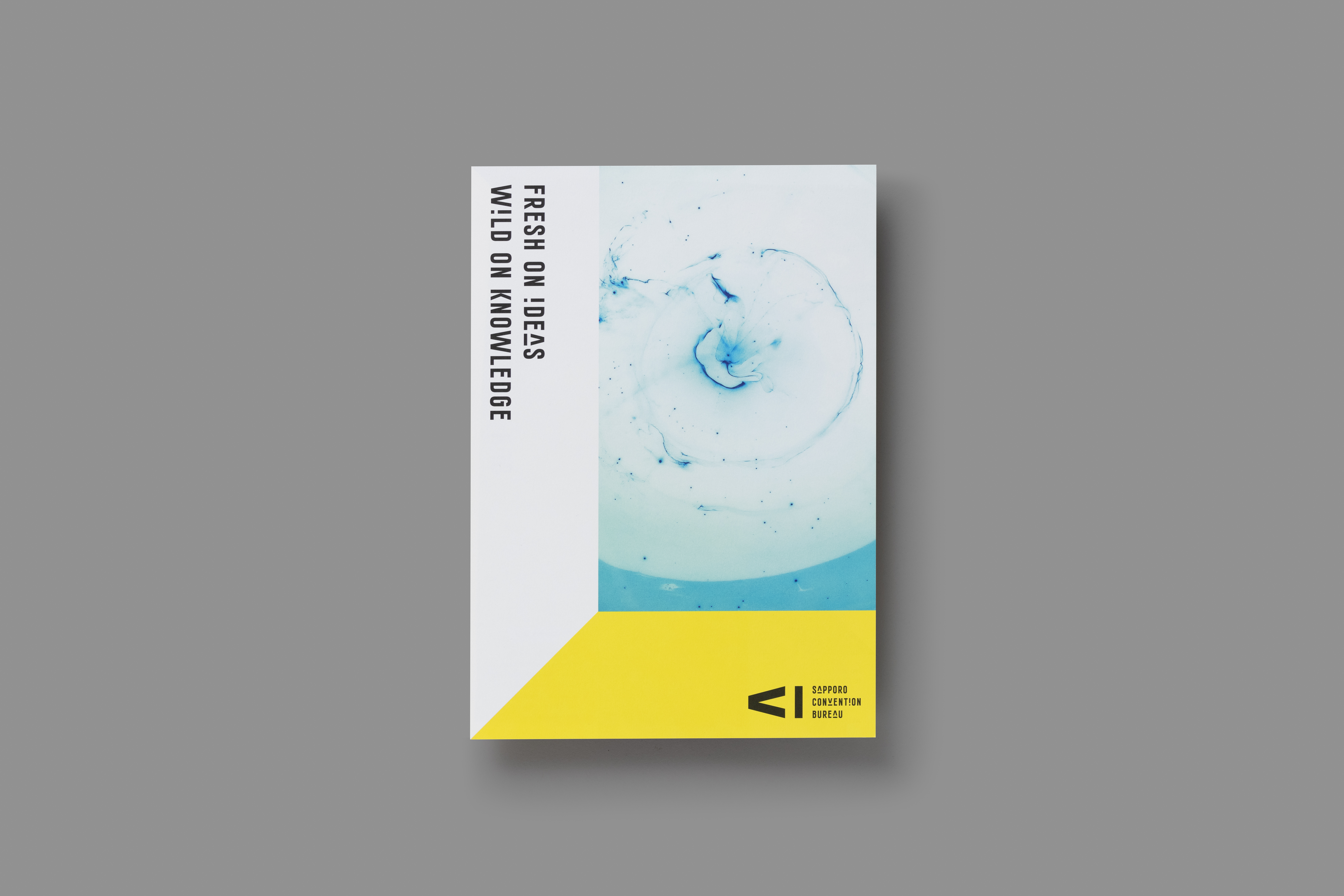
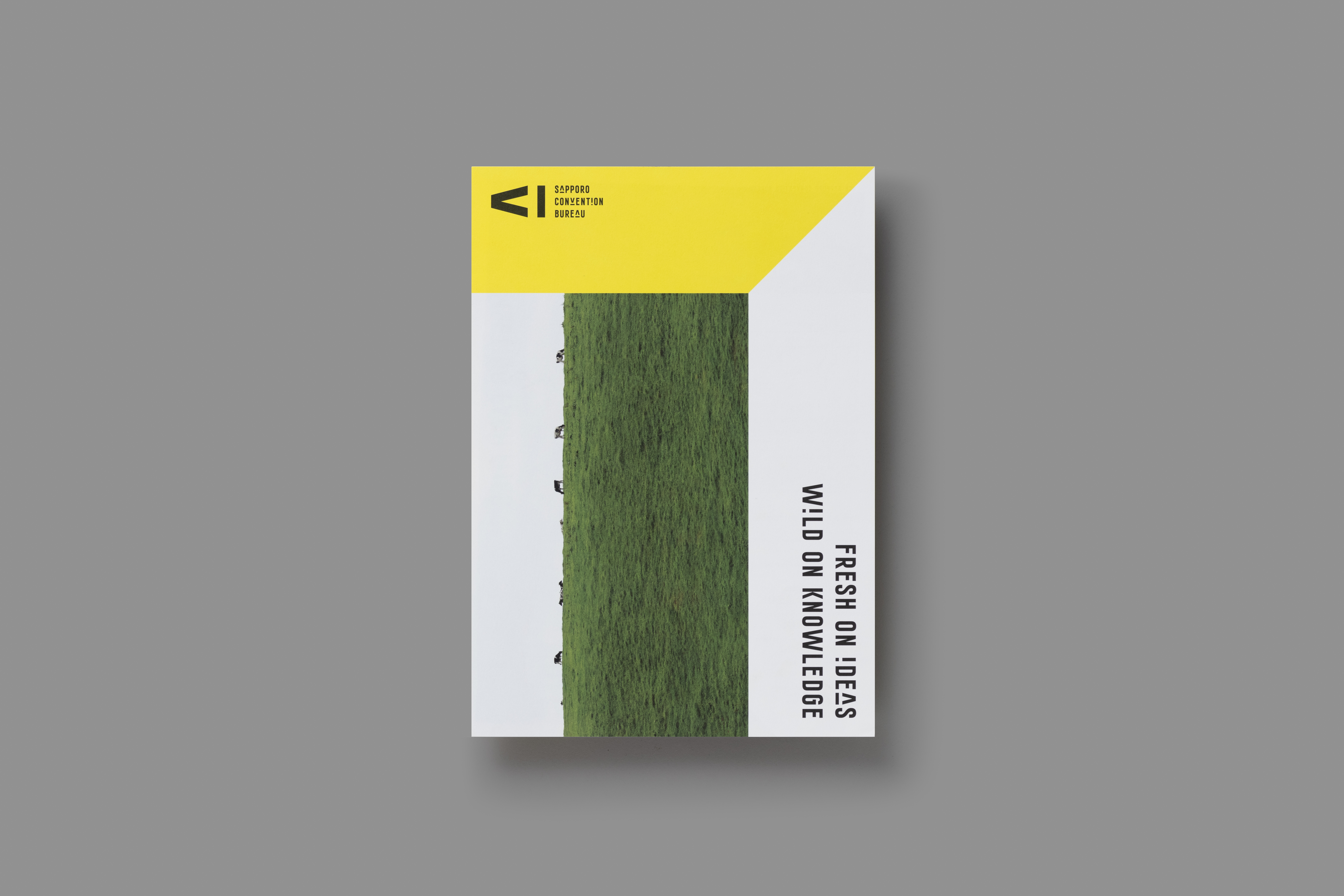
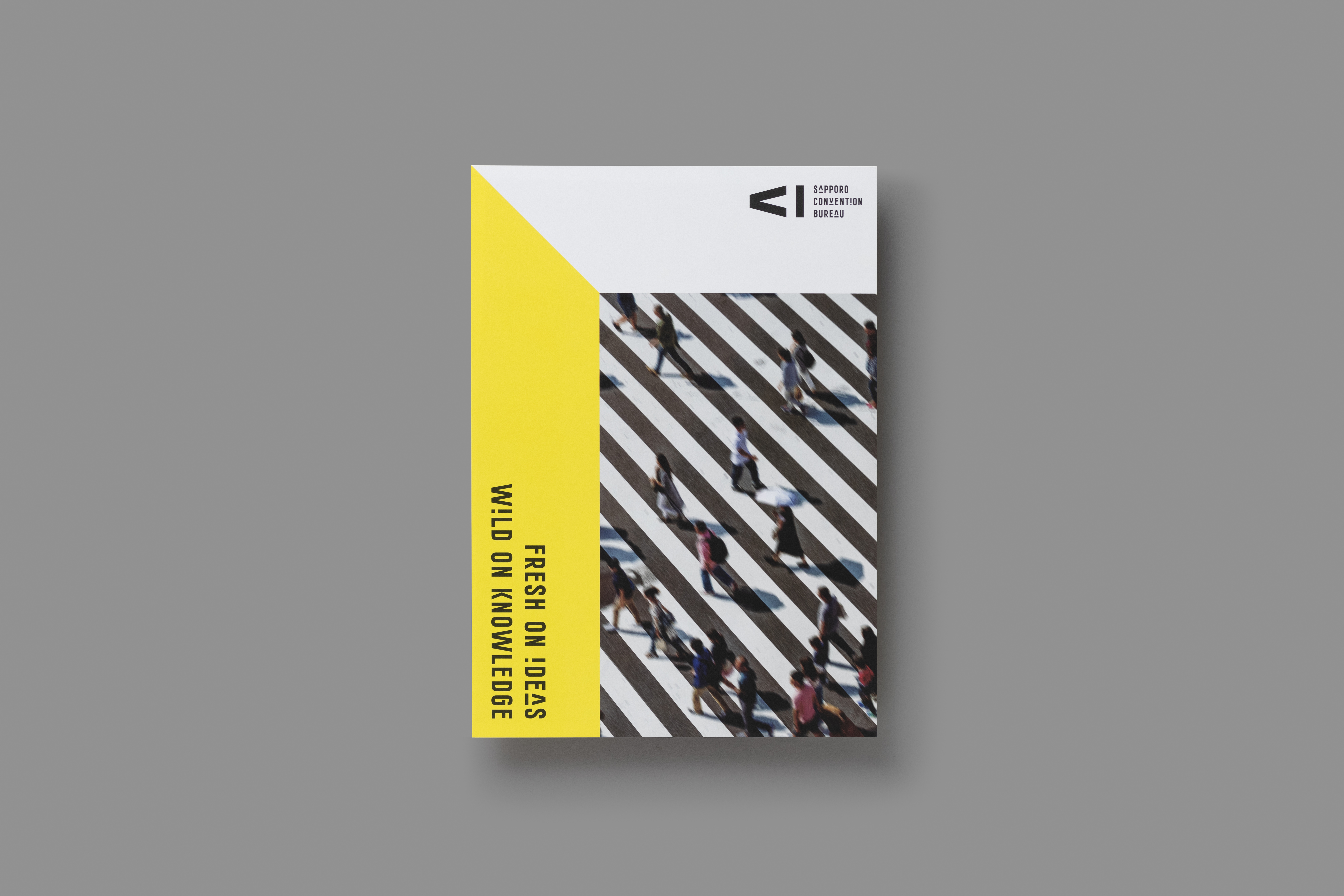
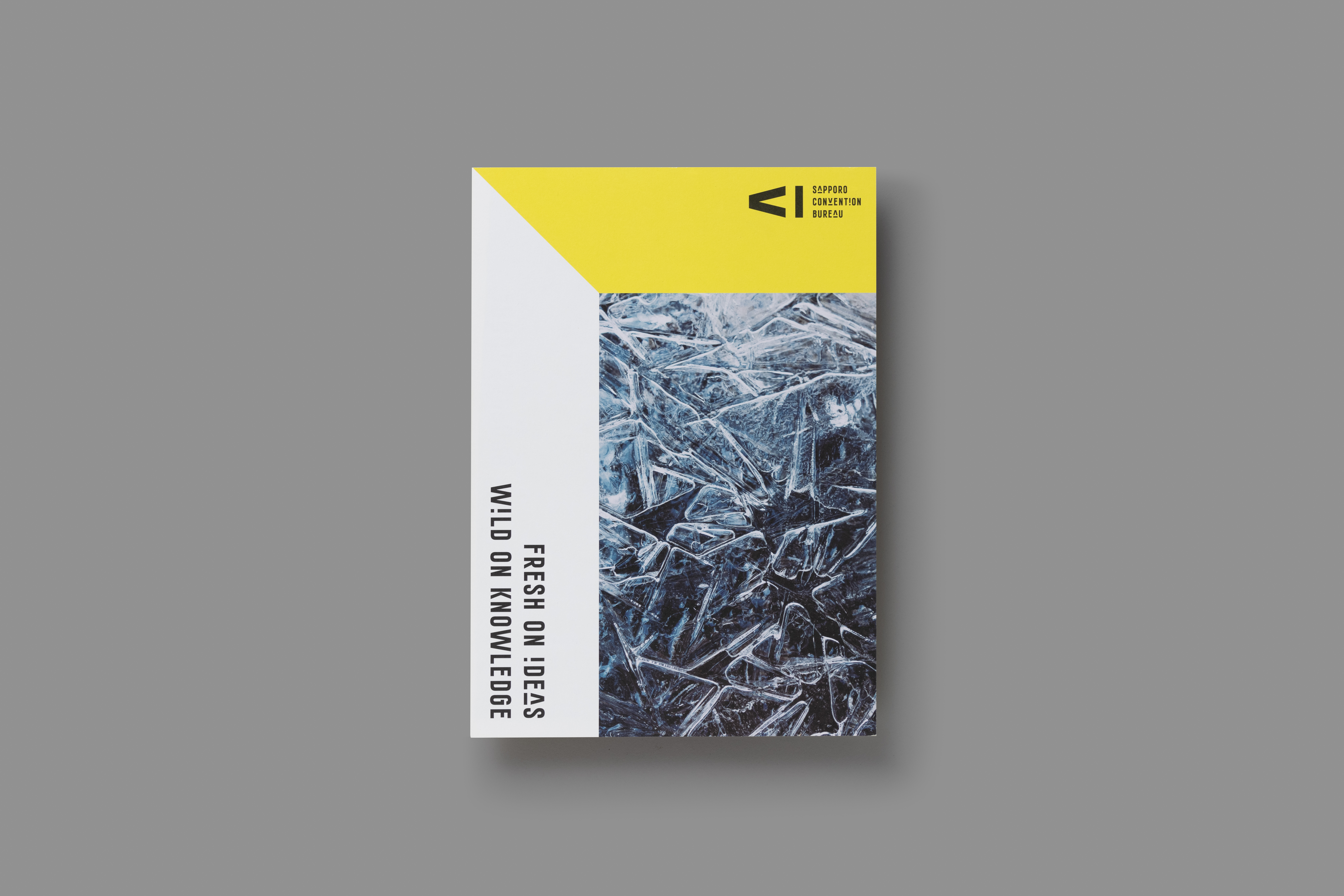
We created a solid logo that expresses the three actions of "to gather," "to look," and "to record" at the events held. The slogan, "Fresh on Ideas, Wild on Knowledge," expresses the idea that Sapporo is a place that fuses Hokkaido's nature with a city, stimulates people's sensitivities, encourages their inspirations, and provides opportunities for new ideas and creations.
By placing vivid yellow, an original typeface, and a solid photograph, which clipped the charm of Hokkaido, in the center of a design and developing it with all tools, we put together a coherent world view. This world view makes the Sapporo Convention Bureau's existence stand out among attractions and activities and establishes a strong identity that remains in the impressions and memories of persons who see this world view.
Project: Sapporo Convention Bureau
Art Direction: Ryo Ueda
Creative Direction: Ryo Ueda
Design: Anna Petek, Yuji Yanou, Noémie Kawakita, Mitsuki Sato, Ruka Kawasaki, Ryo Ueda, etc.
Intern: Enrica Lamia, Cørinne Kesseler, Celia Leung, Mathilde Huss Hansen
Year: 2018 -
Client: Sapporo Convention Bureau
︎
↑ All Projects
︎ Previous Project
︎ Next Project