SOCO
Identity, Signage2020
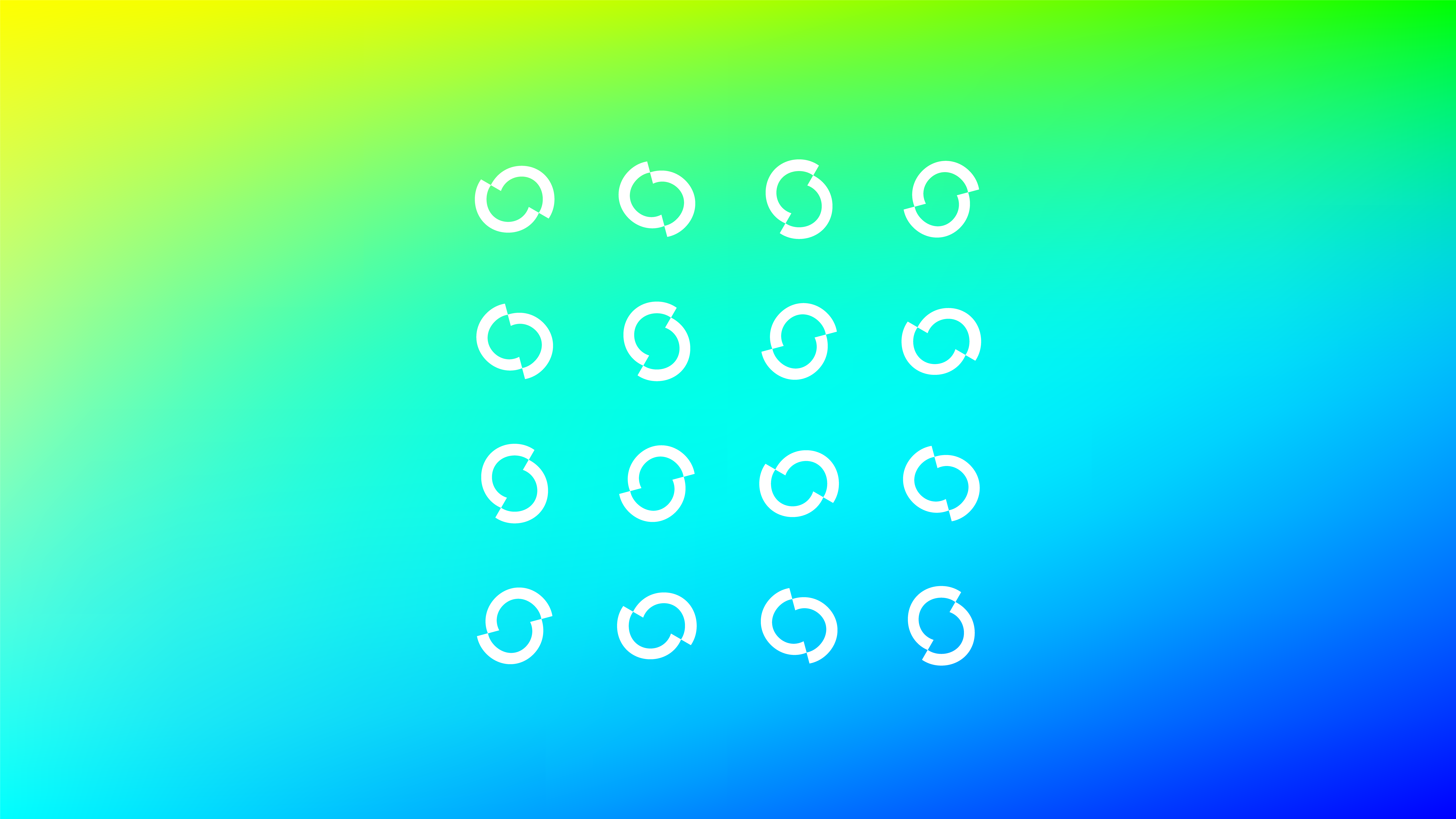
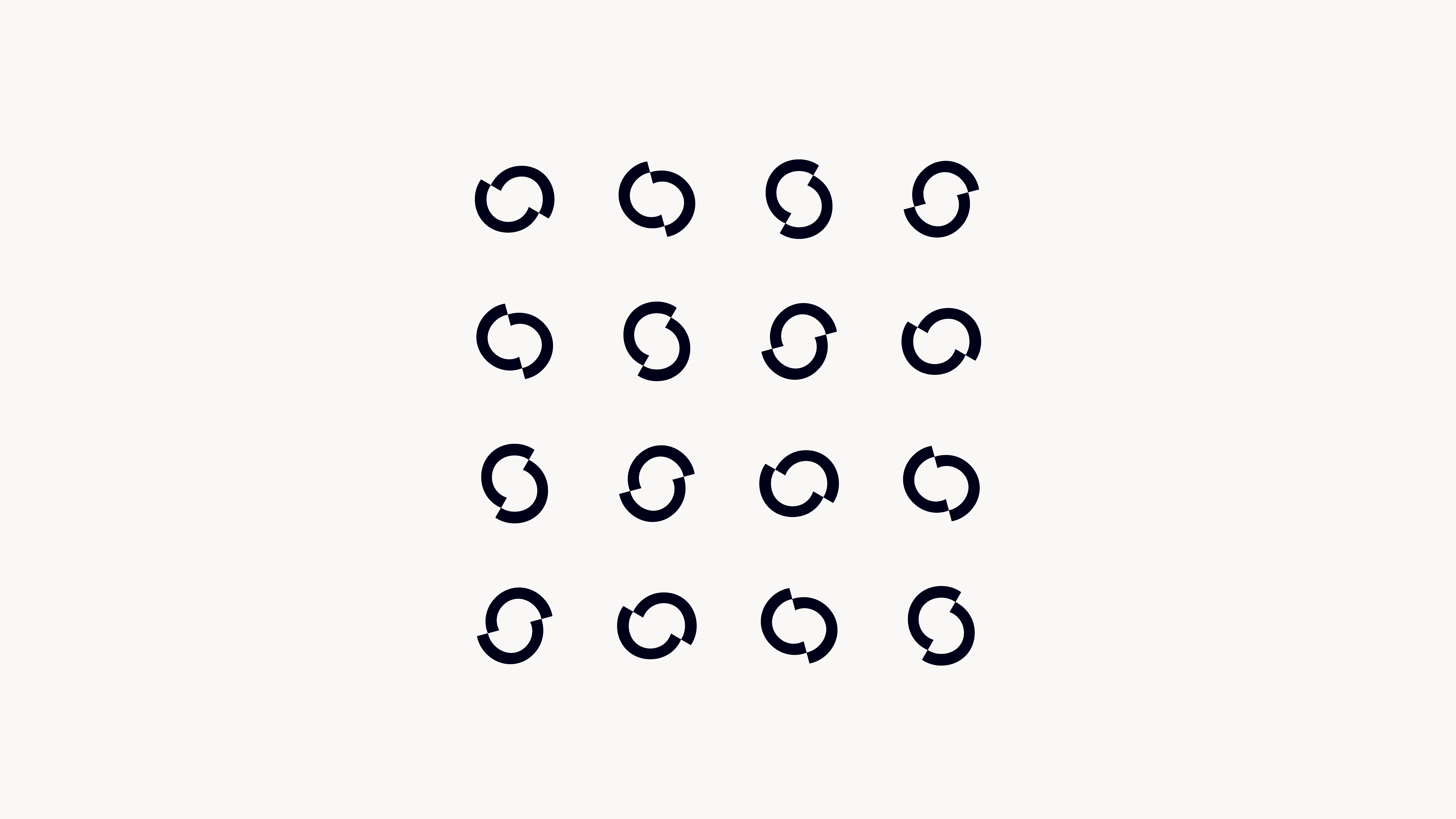
Identity, a hair salon group with a total of 4 stores based on the concept of CREATE FUN, CREATE ANEW.
SOCO, which seeks to create novelty by cutting through the now. AO, which is made to symbolize the wave that start fashion movements. SUN, a playful cut that is also a wordplay on 3 (pronounced as San in Japanese) and SUN. ACA, which uses a simple anagram comprised of continuous alphabets as its key visual component.
We aimed for a hair salon branding that projects charisma and attracts the attention and congregation of youths by elevating unique logos to pop, fun, and novel hairstyles.
Project: SOCO
Art Direction: Ryo Ueda
Design: Noémie kawakita, Anna Petek, Yuji Yanou, Ryo Ueda, etc.
Holden Kao
Interior Design: Mangekyo
Interior Photography: Kei Furuse [GAZE fotographica]
Client: SOCO
Featured in:
MdN Designers File 2021 [MdN Corporation / Japan] (2021)
↑ All Projects
︎ Previous Project
︎ Next Project