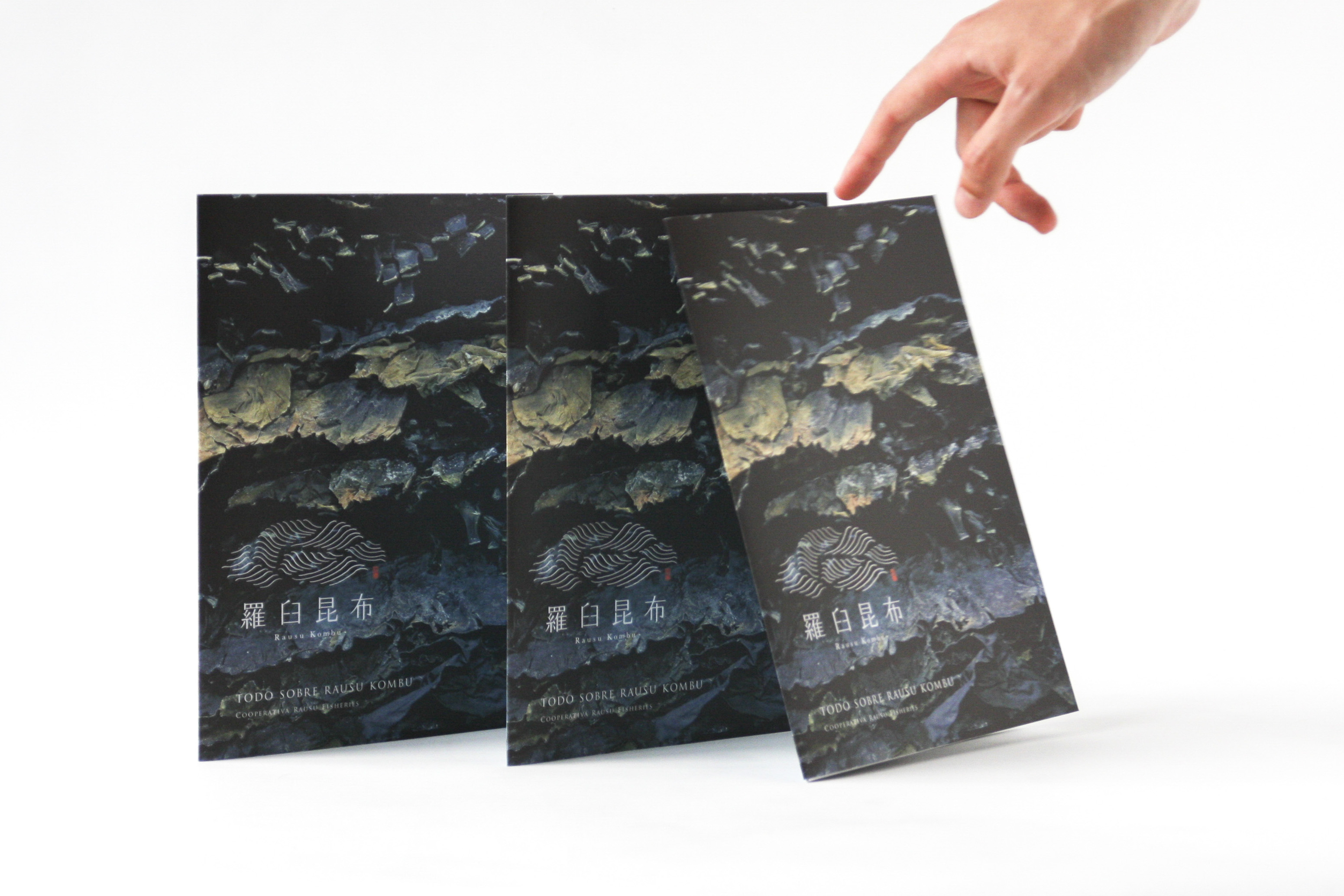
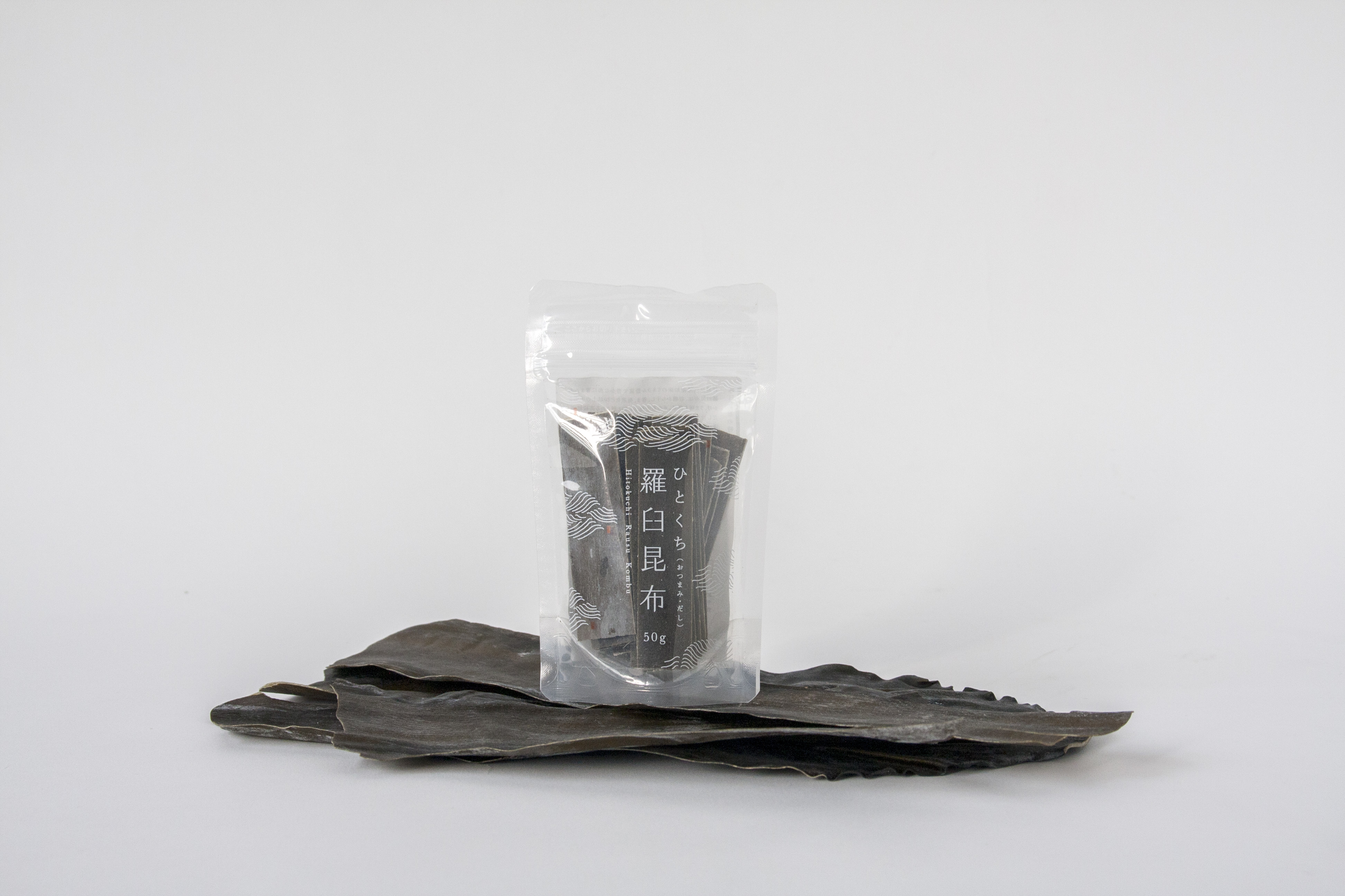
Rausu Kombu
Identity, Packaging, PrintRausu Fisheries Cooperative Association
2015 -
The branding of the kombu from Rausu, the most famous area for kombu production in Japan. We renewed the logo, improved the packaging, and created pamphlets for international use in order to spread the culture of kombu to the younger generation and abroad. Beyond Japan, Rausu Kombu is also promoted in Spain and Italy.
We drew inspiration from how kombu swaying in the sea looks like waves. We elevated the historical Japanese pattern of waves with the rich green of kombu to create a modern yet traditional image for this ancient Japanese ingredient.
Project: Rausu Kombu
Branding: Machi Seisakushitsu
Creative Direction: Kazutada Nakazawa
Art Direction: Ryo Ueda
Design: Daisuke Tsukano, Daisuke Suzuki, Anna Petek, Yuji Yanou, Ryo Ueda, ect.
Celia leung, Ray Rahardja
Illustration: Ayako Kubo, ect.
Copywriting: Kosuke Ikehata
Photography: Hiroyuki Hasegawa, Rie Natta
Planning: Machi Seisakushitsu
Year: 2015
Client: Rausu Fisheries Cooperative Association
Awards:
Sapporo ADC 2017 Poster Category Prize Nomination / Poster
Sapporo ADC 2017 Packaging Category Prize Nomination / Packaging
Sapporo ADC 2021 Packaging Category Selection / Packaging
Featured in:
Nihongo Logo 2 [PIE BOOKS / Japan] (2016)
MdN Designers File 2017 [MdN Corporation / Japan] (2017)
Local Designers Profiles [PIE BOOKS / Japan] (2017)
Design Note No.79 [Seibundo Shinkosha / Japan] (2018)
Commercial Photo 2018/2 [Genkosha / Japan] (2018)
SB Creative / Japan] (2020)
MdN Designers File 2021 [MdN Corporation / Japan] (2021)
↑ All Projects
︎ Previous Project
︎ Next Project