La La La Cookie
Branding, Identity, Product, Packaging, Website
Japan has a deeply ingrained culture of gift giving, and Hokkaido is no exception; this is evidenced by the fact that Shin-Chitose airport is second only to Tokyo's Haneda airport in gift sales, despite servicing nearly a quarter of the passengers. This can be credited to Hokkaido's worldwide renown for some of the freshest ingredients in Japan. Kinotoya, a local confectioner based in Sapporo, Hokkaido, takes advantage of this abundance to create sweets which attract people from far and wide.
A first in their long history, Kinotoya invited us to conceive a new sweet unlike any other from the ground up. Beyond creating the packaging, we proposed the dessert, ingredients, shape, and sales strategies.
With Kinotoya, we decided to confront preconceived notions of the humble cookie and the limits of its deliciousness. Our goal: to create the best cookie with Kinotoya. To be sold exclusively at Shin-Chitose Airport, it was vital that the LaLaLa COOKIE stood out from the competition. This necessitated a new approach.
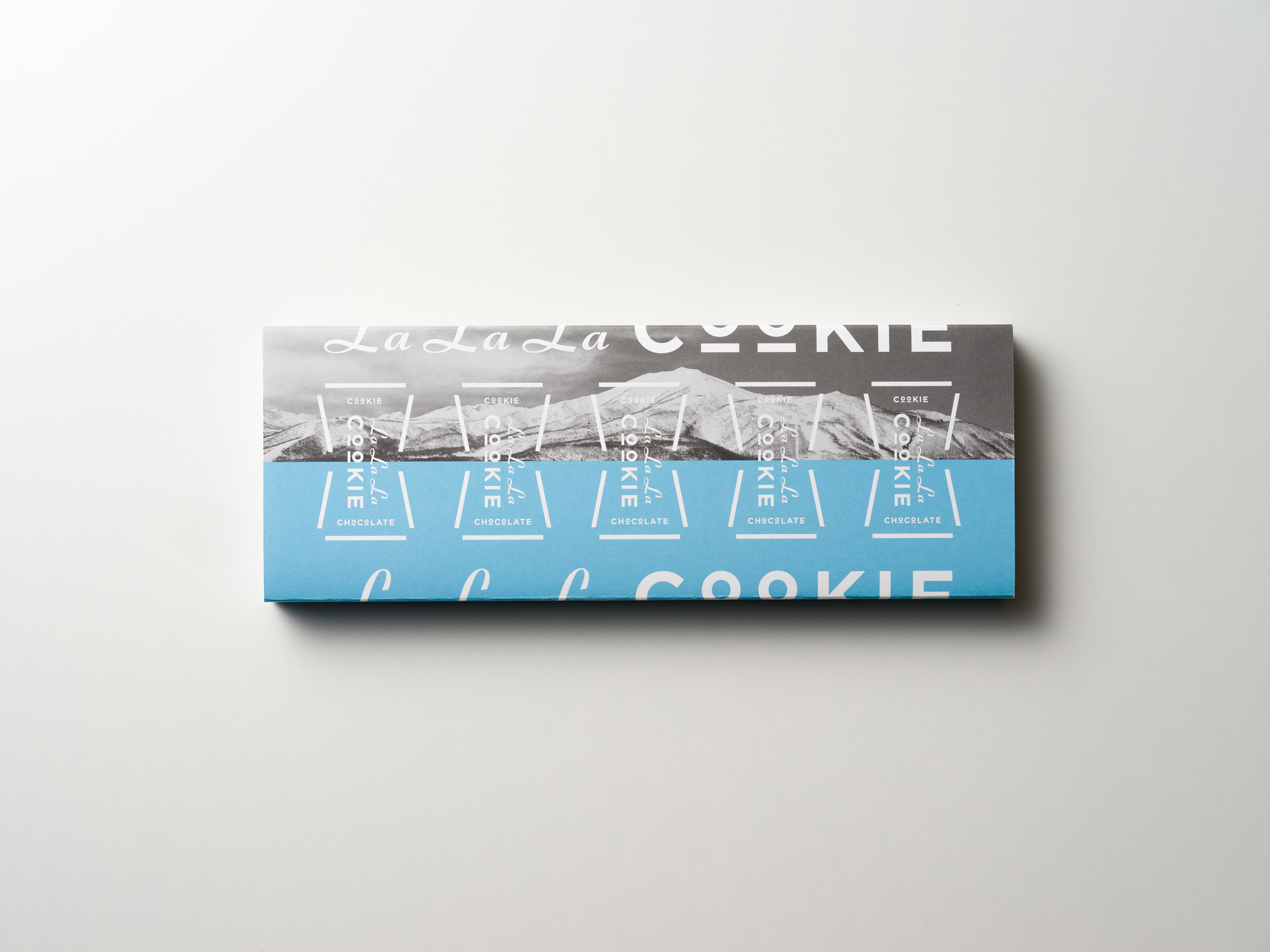
Challenging what dessert packaging can be, we gave the LaLaLa COOKIE a pop feeling and bold typography. A mountain frontier and a sharp blue representing Hokkaido's soaring skies come together, just as two halves of the cookie meet together. A gift by design, we wanted those taking the LaLaLa COOKIE home, to be able to share the wonder of Hokkaido, beyond the locally sourced the butter, "Kitanohami" flour, beet sugar, and chocolate made with Hokkaido cream.
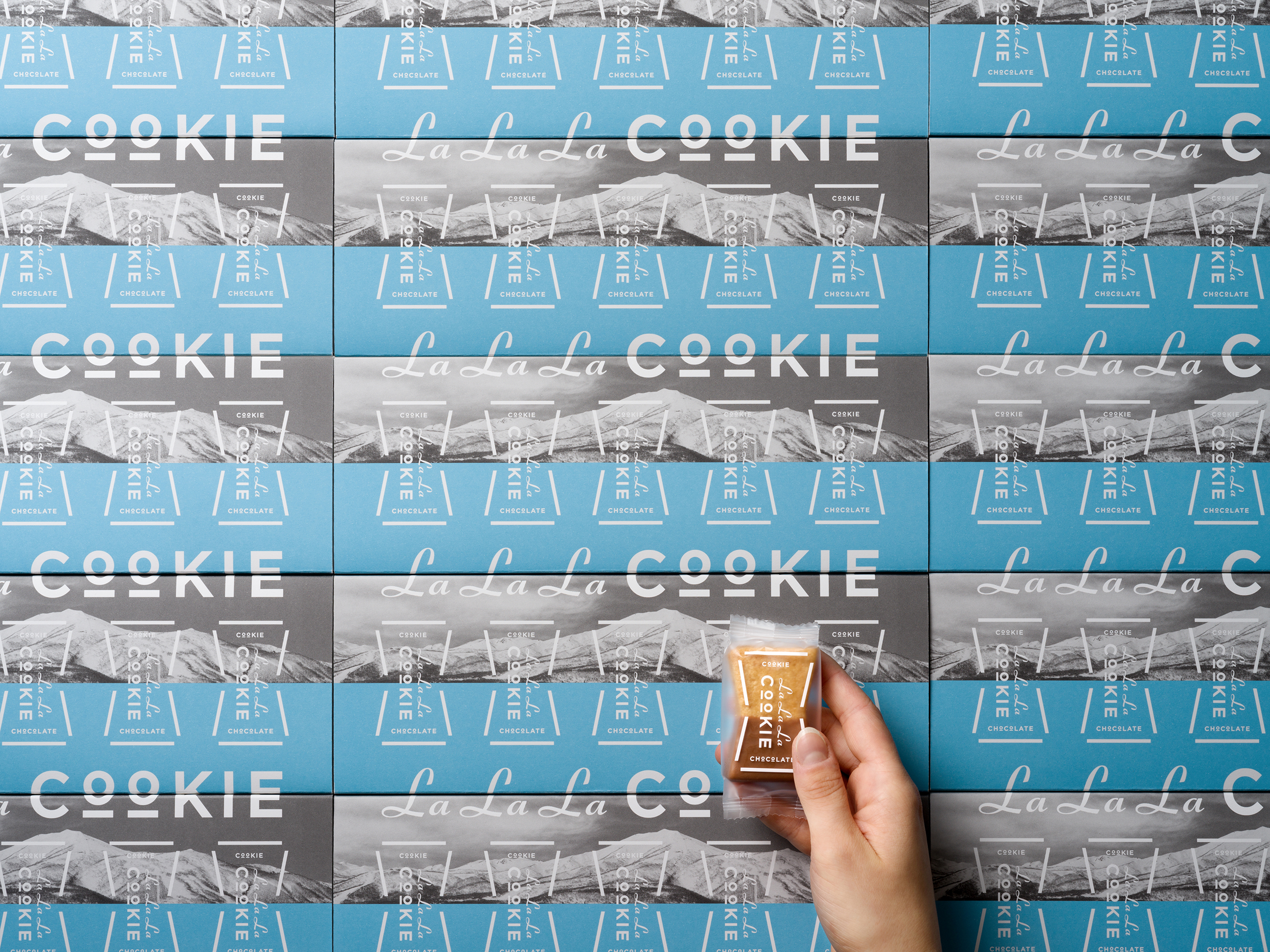
Not a circle, nor a square, the shape of these cookies are proof that they are handmade. Each cookie has 3 layers, hence LaLaLa COOKIE, a cheery "La" for each layer. The delicate bow-shaped layers cannot be assembled by machine, limiting the quantity to 200 boxes per day. The logo, which becomes a pattern on the box, reflects this symbol of their quality.
The size of the packaging was taken into careful consideration. Each individual cookie costs around $2 (USD), no small cost for a cookie. Each box holds just five cookies, reflecting the premium status of the LaLaLa COOKIE, while also maintaining a convenient size to travel with. Dedicated shopping bags aid in convenience, while highlighting the LaLaLa COOKIE.
As a part of our novel strategy, we went beyond packaging and created a website solely for the LaLaLa COOKIE (http://www.kinotoya.com/item/lalalacookie/), elevating the cookie beyond what we imagine a cookie is. Those browsing Kinotoya's website will be transported away from the main site, emphasizing the singularity of the LaLaLa COOKIE.
The fresh design and delicious original cookies will make you want to sing "La La La~."
Project: Lalala Cookie
Creative Direction: Osamu Takado
Art Direction: Ryo Ueda
Design: Ryo Ueda, Anna Petek, ect.
Intern: Alessandro Riva
Copywriting: Osamu Takado
Web Direction: Yasushi Yamashita [Frencel]
Web Development: Toru Shinbo [Frencel]
Photography: Tsubasa Fujikura
Styling: Sachiko Ishikiriyama
Model: Cørinne Kesseler
Year: 2017 - 2018
Client: Kinotoya
Award:
Sapporo ADC 2018 Packaging Bronze Prize / Packaging
Sapporo ADC 2018 CI, Symbol, Logo & Typography Category Selection / Logo
JAGDA 2019 Packaging Category Selection / Packaging
Featured in:
MdN Designers File 2019 [MsN Corporetion / Japan] (2019)
The Best Kawaii package Designs [ PIE BOOKS / Japan] (2019)
Cutting Edge Designs in Packaging and Branding [PIE BOOKS / Japan] (2019)
MdN Designers File 2021 [MsN Corporetion / Japan] (2021)
︎ ↑ All Projects
Branding, Identity, Product, Packaging, Website
Japan has a deeply ingrained culture of gift giving, and Hokkaido is no exception; this is evidenced by the fact that Shin-Chitose airport is second only to Tokyo's Haneda airport in gift sales, despite servicing nearly a quarter of the passengers. This can be credited to Hokkaido's worldwide renown for some of the freshest ingredients in Japan. Kinotoya, a local confectioner based in Sapporo, Hokkaido, takes advantage of this abundance to create sweets which attract people from far and wide.
A first in their long history, Kinotoya invited us to conceive a new sweet unlike any other from the ground up. Beyond creating the packaging, we proposed the dessert, ingredients, shape, and sales strategies.
With Kinotoya, we decided to confront preconceived notions of the humble cookie and the limits of its deliciousness. Our goal: to create the best cookie with Kinotoya. To be sold exclusively at Shin-Chitose Airport, it was vital that the LaLaLa COOKIE stood out from the competition. This necessitated a new approach.
Challenging what dessert packaging can be, we gave the LaLaLa COOKIE a pop feeling and bold typography. A mountain frontier and a sharp blue representing Hokkaido's soaring skies come together, just as two halves of the cookie meet together. A gift by design, we wanted those taking the LaLaLa COOKIE home, to be able to share the wonder of Hokkaido, beyond the locally sourced the butter, "Kitanohami" flour, beet sugar, and chocolate made with Hokkaido cream.
Not a circle, nor a square, the shape of these cookies are proof that they are handmade. Each cookie has 3 layers, hence LaLaLa COOKIE, a cheery "La" for each layer. The delicate bow-shaped layers cannot be assembled by machine, limiting the quantity to 200 boxes per day. The logo, which becomes a pattern on the box, reflects this symbol of their quality.
The size of the packaging was taken into careful consideration. Each individual cookie costs around $2 (USD), no small cost for a cookie. Each box holds just five cookies, reflecting the premium status of the LaLaLa COOKIE, while also maintaining a convenient size to travel with. Dedicated shopping bags aid in convenience, while highlighting the LaLaLa COOKIE.
As a part of our novel strategy, we went beyond packaging and created a website solely for the LaLaLa COOKIE (http://www.kinotoya.com/item/lalalacookie/), elevating the cookie beyond what we imagine a cookie is. Those browsing Kinotoya's website will be transported away from the main site, emphasizing the singularity of the LaLaLa COOKIE.
The fresh design and delicious original cookies will make you want to sing "La La La~."
Project: Lalala Cookie
Creative Direction: Osamu Takado
Art Direction: Ryo Ueda
Design: Ryo Ueda, Anna Petek, ect.
Intern: Alessandro Riva
Copywriting: Osamu Takado
Web Direction: Yasushi Yamashita [Frencel]
Web Development: Toru Shinbo [Frencel]
Photography: Tsubasa Fujikura
Styling: Sachiko Ishikiriyama
Model: Cørinne Kesseler
Year: 2017 - 2018
Client: Kinotoya
Award:
Sapporo ADC 2018 Packaging Bronze Prize / Packaging
Sapporo ADC 2018 CI, Symbol, Logo & Typography Category Selection / Logo
JAGDA 2019 Packaging Category Selection / Packaging
Featured in:
MdN Designers File 2019 [MsN Corporetion / Japan] (2019)
The Best Kawaii package Designs [ PIE BOOKS / Japan] (2019)
Cutting Edge Designs in Packaging and Branding [PIE BOOKS / Japan] (2019)
MdN Designers File 2021 [MsN Corporetion / Japan] (2021)
︎ ↑ All Projects